Bookshelf Aesthetic Ideas That Make Any Room Feel More Collected
- Home Organization Ideas Living Room
 Alina
Alina- 0
- 14 minutes read


You’ve seen the shelves on Pinterest, the ones that look like a magazine, books and objects and a little trailing plant all arranged with such ease it seems accidental. Then you look at your own: spines crammed edge to edge, a stack of paperbacks toppling sideways, a random candle wedged in a gap. It’s not that your things aren’t nice. It’s that nobody ever told you the shelf is something you compose, not just fill.
The gap between “chaotic” and “curated” isn’t taste or money, it’s a handful of techniques designers use on every shelf they touch. Once you can see them, you can’t unsee them, and your own shelves stop looking like storage and start looking collected. Here’s the method, demystified.
Start by taking everything off
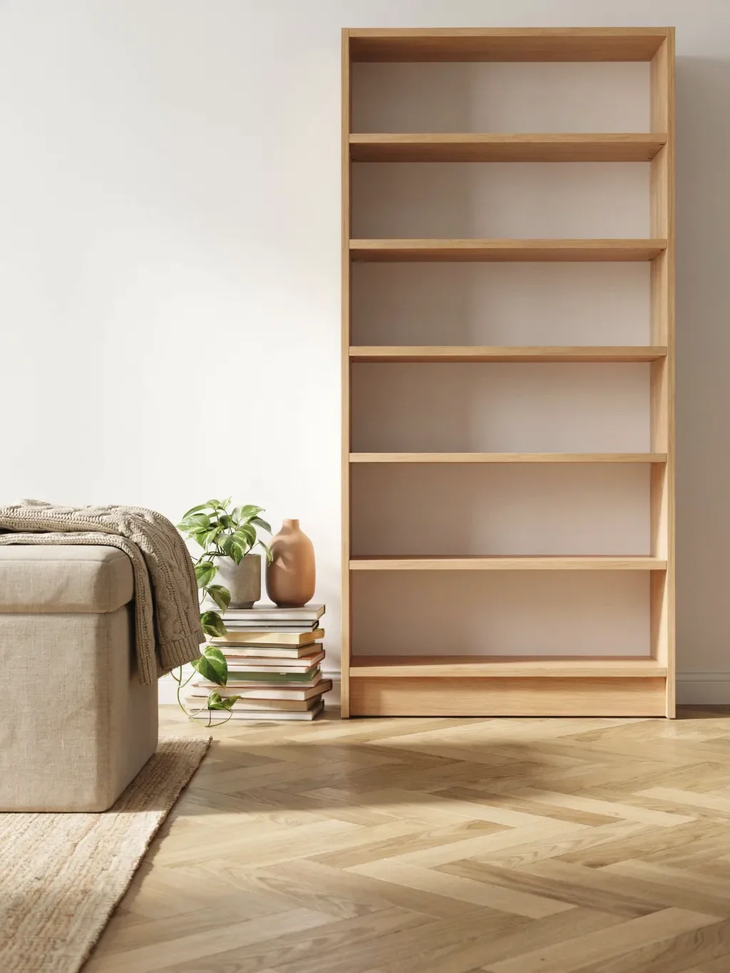
Counterintuitive, but every designer does it: clear the shelves completely before styling. You can’t compose an arrangement around a mess that’s already there, and a blank shelf lets you see what you’re actually working with. Pull everything off, then sort your books by size and gather your non-book objects, vases, bowls, frames, boxes, candles, in one place so you can see your whole palette of pieces.
This is also your moment to edit. Not every book and trinket you own needs to be on display. The curated look starts with choosing what earns a spot, not cramming in everything you have.
Stack books two ways: some vertical, some horizontal
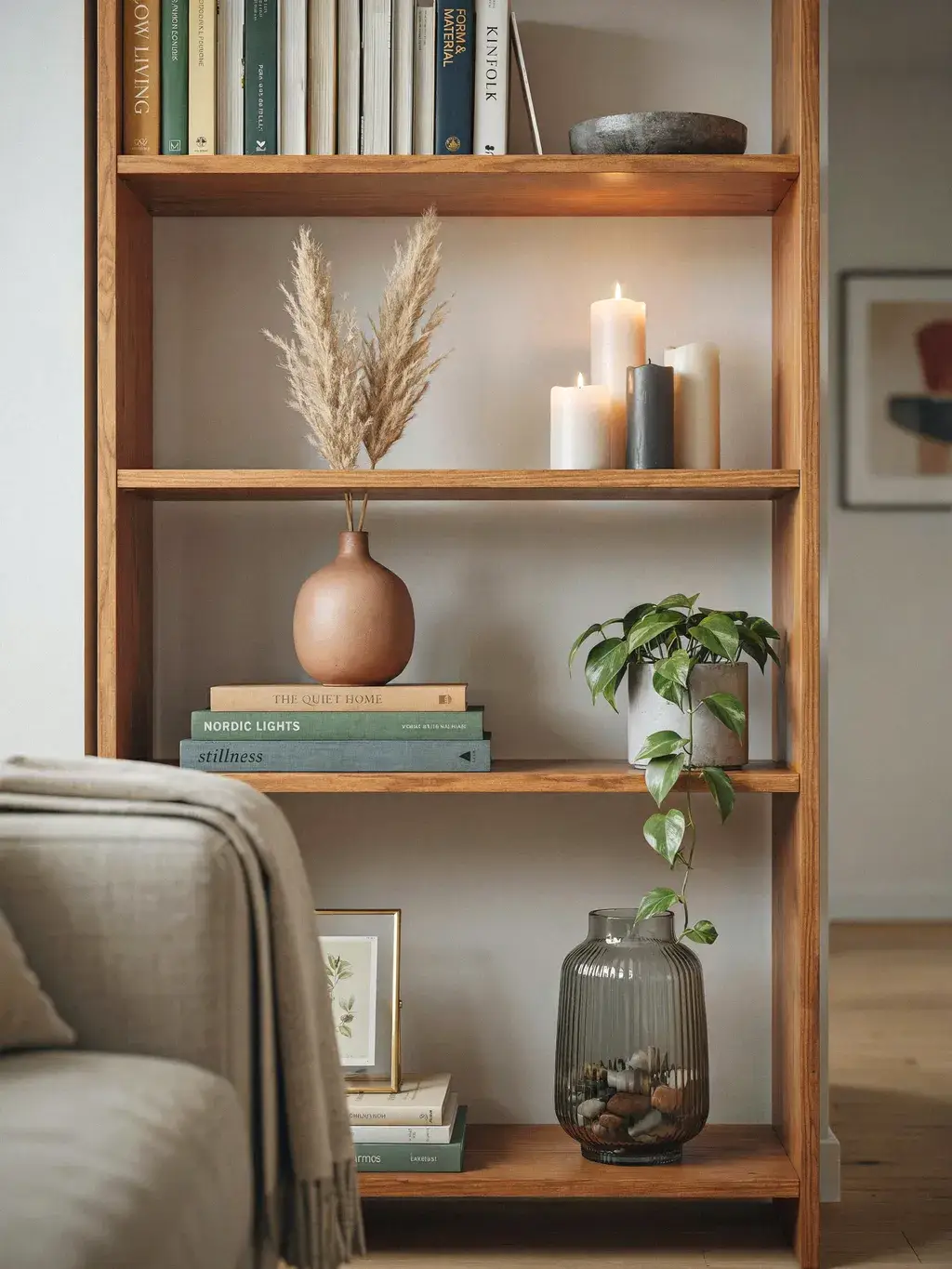
Here’s the single technique that most instantly reads as “styled”: don’t stand all your books upright in one long military row. Mix vertical rows with horizontal stacks. Stand some books up as usual, then lay others flat in short stacks, and use those horizontal stacks as little pedestals to set an object on top, a small vase, a bowl, a sculpture.
This mix breaks the monotony of a wall of spines and creates the layered, intentional look you’re after. The horizontal stacks also add visual “rests” for the eye and give you display surfaces at different heights. It’s the difference between a shelf that reads as a library catalogue and one that reads as a styled vignette.
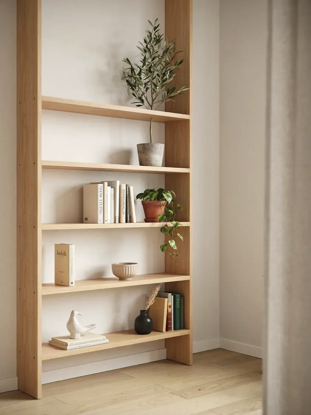
Work in threes and vary every height
Designers swear by the rule of three (and odd numbers generally) because groupings of three just look balanced and intentional in a way pairs and rows don’t. Arrange your objects in little trios, and within each, vary the heights, shapes, and scales: something tall, something medium, something low.
The cardinal sin here is sameness. Everything the same height is, as one designer puts it, a visual snooze. Mix tall and short, wide and narrow, a tall vase beside a low bowl beside a stack of books. That variety in scale is a huge part of what makes a shelf feel collected rather than flat. Draw the eye up and down across the unit, never let it run along one boring level line.
Leave empty space on purpose
The most common reason a shelf looks chaotic is that it’s stuffed to the very edges with no room to breathe. Curated shelves always leave negative space, deliberate gaps of nothing that let the pieces you’ve chosen actually be seen.
Resist the urge to fill every inch. Empty space isn’t wasted, it’s what makes the objects around it feel chosen and important rather than crammed. If your shelf feels busy and cluttered no matter what you do, the fix is almost always to remove things, not add them. Breathing room is the quiet luxury that separates a styled shelf from a packed one.
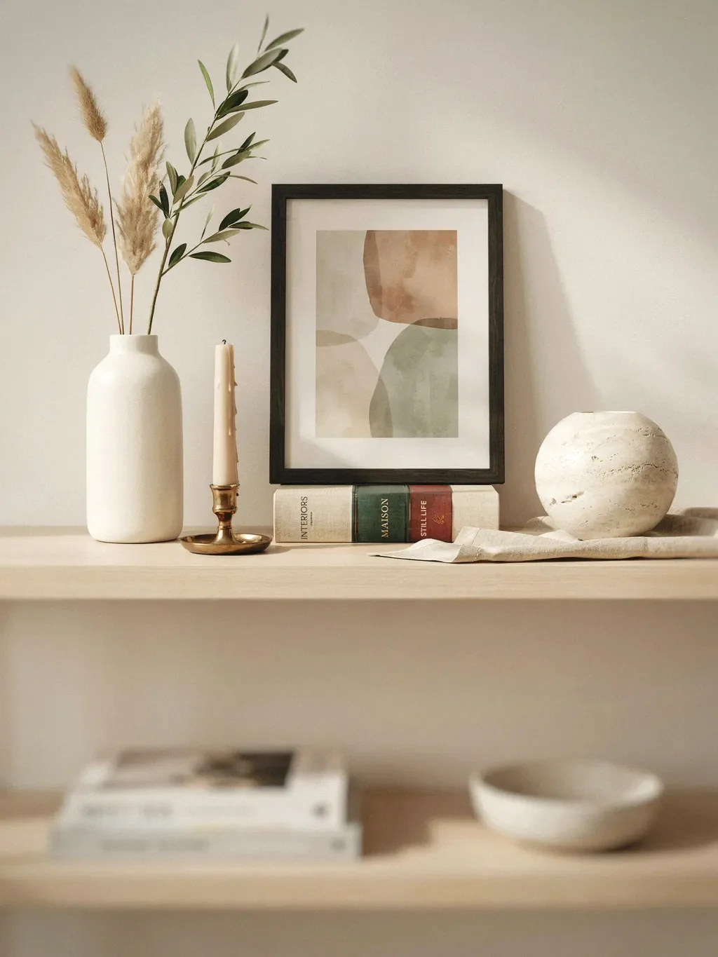
Layer front to back, and lean some art
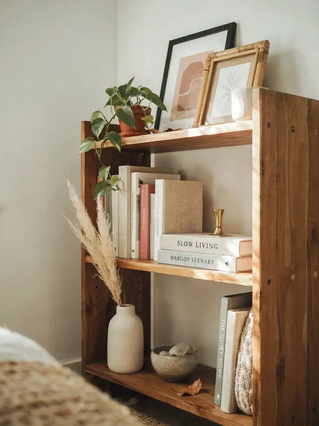
Flat, single-depth arrangements look like storage; layered ones look designed. Build depth by placing taller items at the back and shorter ones in front, and by leaning a piece of framed art or a print against the back of the shelf, then setting a smaller object or a short stack of books just in front of it.
This overlapping, front-to-back layering is a designer staple that adds richness and that lived-in, gathered-over-time feeling. A leaned frame instead of a hung one reads as relaxed and collected. Even on a shelf full of books, tucking a small piece of art behind a stack adds the depth that flat rows lack.
Pick a loose color palette and stick to it
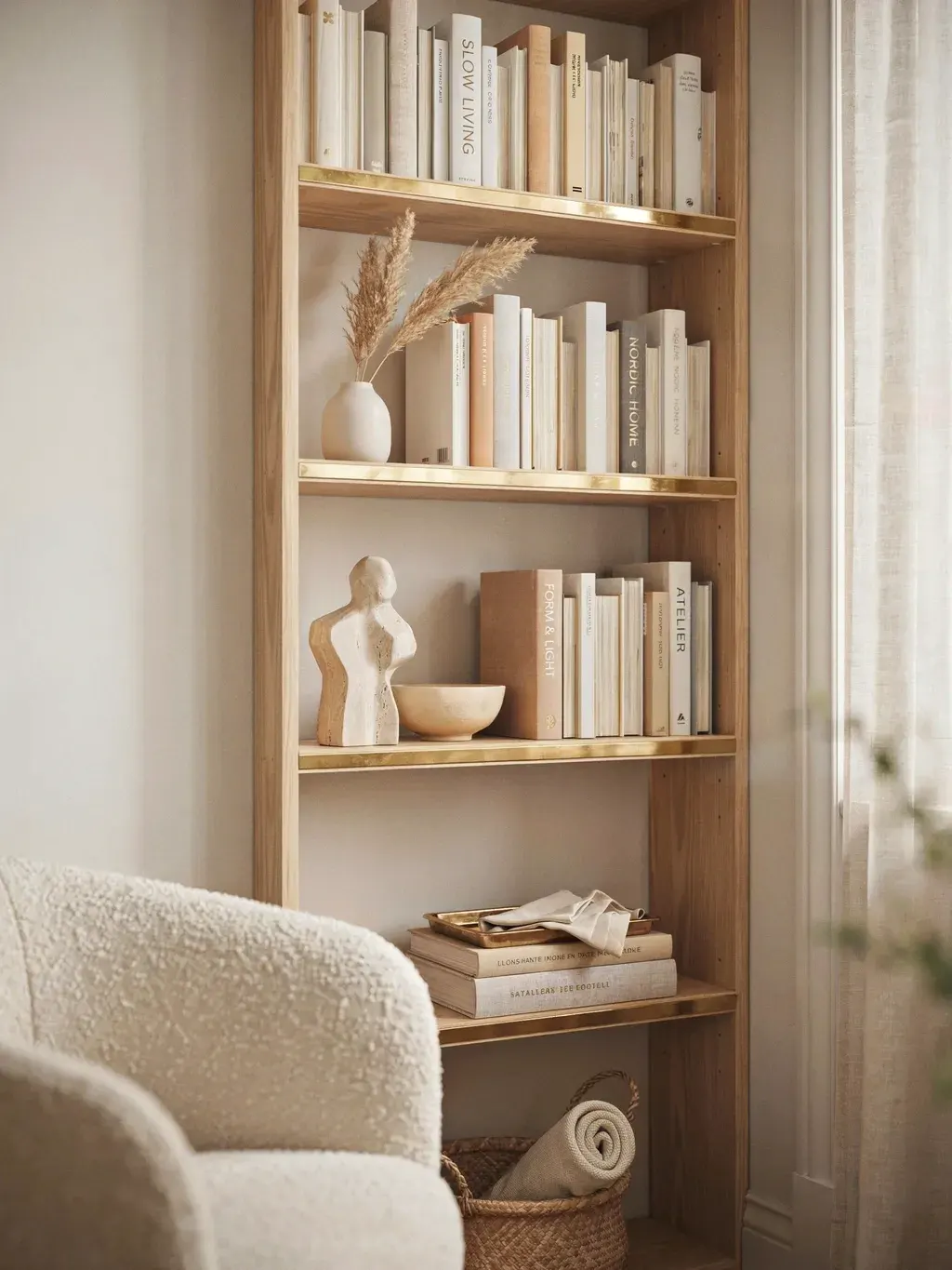
A huge amount of what makes Pinterest shelves look cohesive is simply restraint with colour. Choose a loose palette, usually a neutral base with a few repeating accent colours, and let it guide what goes on the shelf. The riot of clashing book spines and mismatched objects is often what’s making yours feel chaotic.
You don’t have to be rigid, but a consistent thread, whether it’s colour, or a material like wood and brass, or even subject matter, is what ties a collection together. For books specifically, you can organise by colour for a striking, immediately “curated” effect, or remove the busy dust jackets to reveal the calmer cloth bindings underneath. Either trick quiets the visual noise instantly.
Repeat colors and shapes diagonally across the whole unit
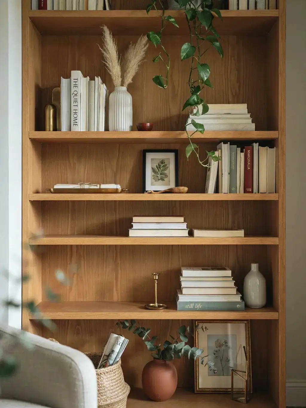
This is the pro move most people never think of, and it’s what makes a whole bookcase feel composed rather than a set of unrelated shelves. Don’t style each shelf in isolation. Instead, repeat your tones and shapes diagonally across the unit: if you place something brass in the upper left, echo brass again in the lower right, and maybe once more to reinforce it.
The same goes for shapes, if you have a stack of books topped with an object in one spot, repeat that “stacked” motif diagonally elsewhere. This diagonal repetition creates a visual rhythm that pulls the whole piece together. And think in terms of distributing visual weight evenly across the entire bookcase rather than making every shelf an identical mirror of the next, which looks stiff and cookie-cutter.
Put the heavy stuff at the bottom
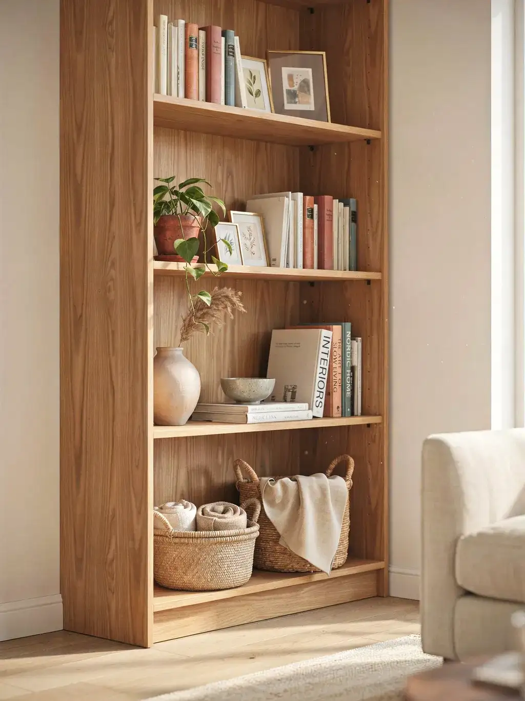
A simple principle that helps both looks and stability: anchor the arrangement with your heaviest, largest items on the lower shelves, big art books stacked horizontally, a chunky vase, a basket. This grounds the whole bookcase visually so it doesn’t look top-heavy, and it physically stabilises a freestanding unit by keeping the weight low.
Save the smaller, lighter, more delicate paperbacks and objects for the upper shelves. A shelf that’s heavy at the bottom and lighter as it rises feels naturally balanced, the same way a well-composed room does.
Add greenery, texture, and a little of you
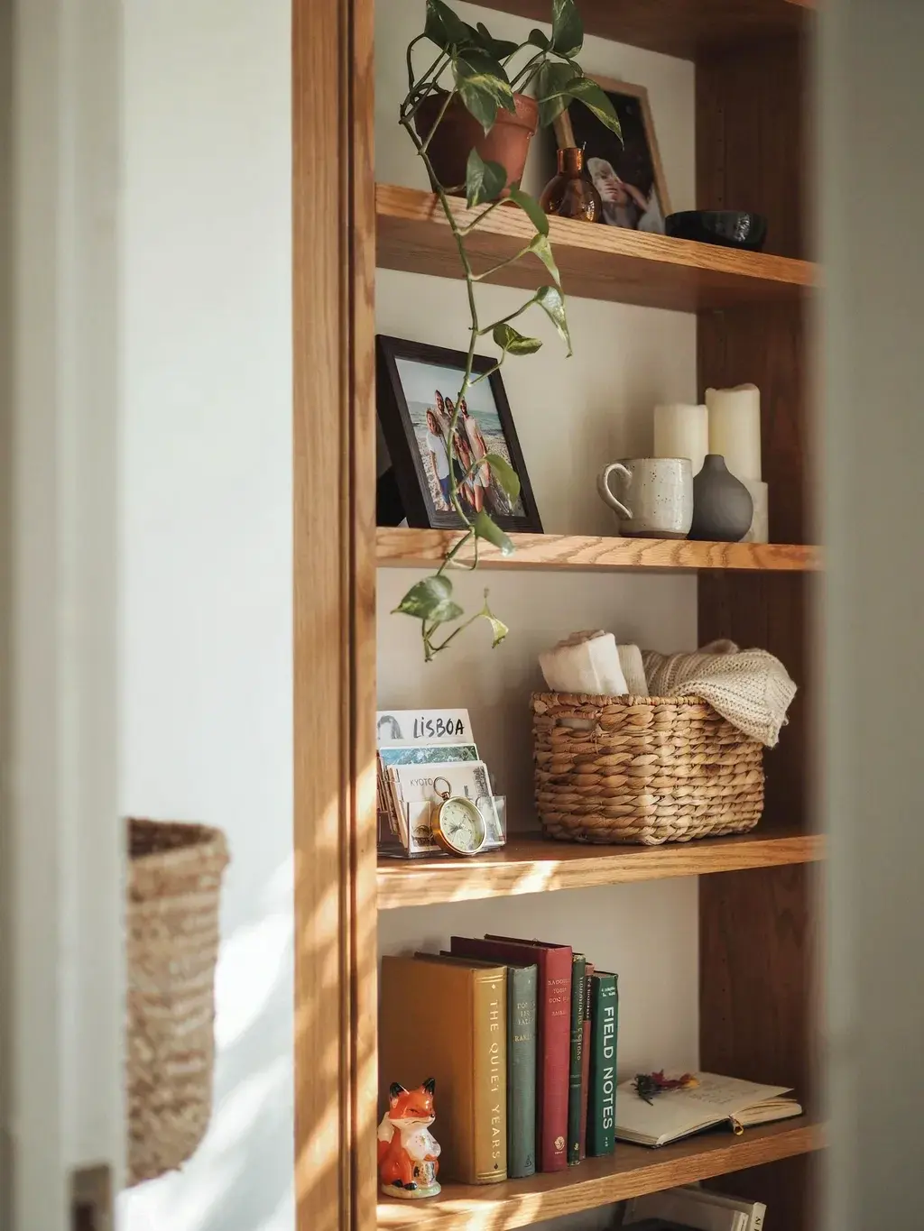
Three finishing touches lift a shelf from competent to warm. First, greenery, a small trailing plant, a sprig in a bud vase, even a faux stem, adds life and softness that an all-books-and-ceramics shelf lacks. Second, texture: mix materials so the eye keeps moving, a smooth glazed vase next to a woven basket next to warm wood next to a metal object.
Third, and most important, make it personal. The shelves that feel truly collected are full of things with meaning, a travel find, a framed photo, an inherited bowl, gathered over time rather than bought all at once in a single shopping trip. A shelf styled entirely from new matching purchases looks like a showroom; one built from things you actually love looks like you. That personal, collected-over-years quality is the thing Pinterest can’t sell you, and it’s what makes a shelf feel like home.
The bottom line
Your shelves don’t look chaotic because your taste is wrong, they look chaotic because they’re filled rather than composed. Clear them off, mix vertical books with horizontal stacks, group in threes at varied heights, leave deliberate gaps, layer art behind objects, hold to a loose colour palette, repeat your tones diagonally, weight the bottom, and finish with greenery and a few things that are genuinely yours. None of it is hard once you can see the moves. Do even half of them, and the shelf that used to look like a pile starts to look like it was styled, because now it was, by you.


